
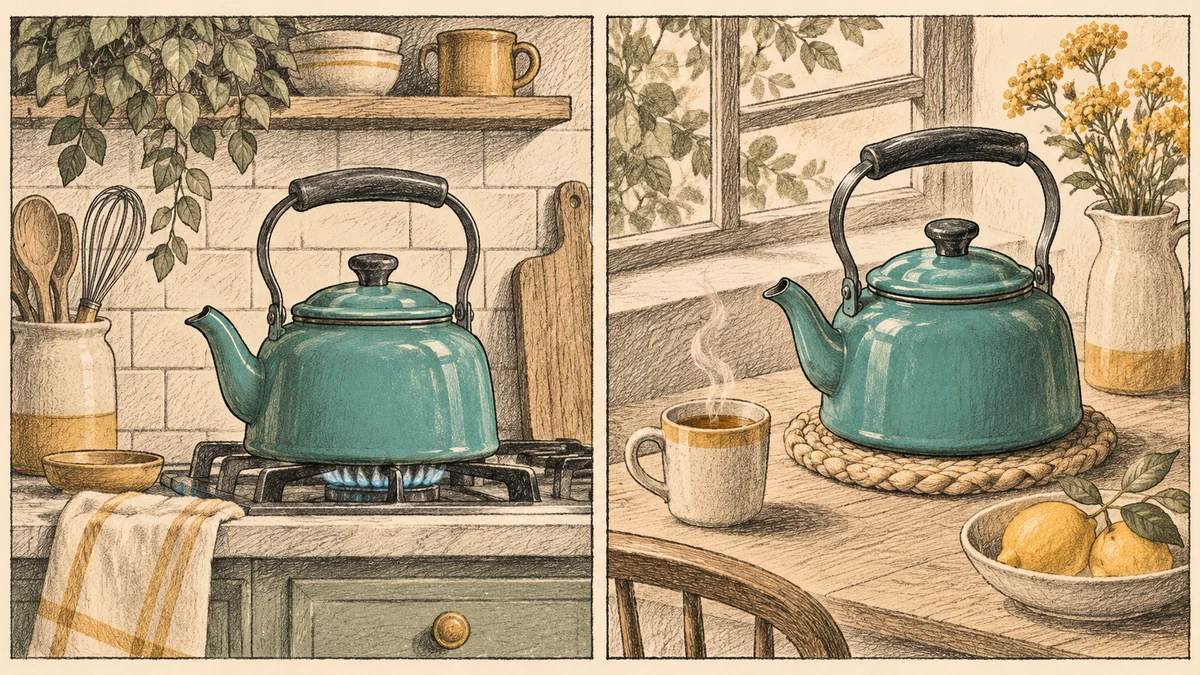
To match color across AI video clips, pick one reference frame per scene, correct exposure and white balance on each shot, then compare the recurring subject across the cut. Apply the creative grade after the shots look coherent. If a clip changes color halfway through, check whether the shift is gradual enough to correct or whether you need to replace the shot.
Adobe announced Color Mode in Premiere on November 10, 2026. Its updated Comparison View documentation describes using a reference frame and visual or scope feedback to match shots. The workflow below applies that principle to AI clips, where each generation can introduce its own color cast. Adobe MAX announcement · Adobe Comparison View guide
- Pick a reference frame
- Correct before you grade
- Review the color at each cut
- Frequently asked questions
Pick a reference frame
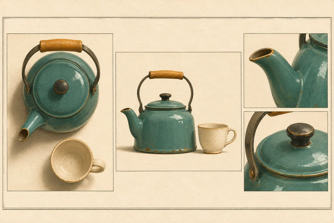
Choose a frame with the intended light and a clear view of something that appears in neighboring shots. For a kitchen product clip, use an approved frame where the teal enamel kettle and cream cup are visible together. The kettle gives you a subject color to compare, and the cup helps reveal a broad cast. If the product needs to match real packaging or a catalog photo, keep the approved photo handy as a separate check.
Use a frame near the cut when you compare adjacent shots. The wide shot might start with neutral light but shift warmer by the time the close-up begins. A reference taken from the start of the wide shot can hide that problem. Use one shared reference for the scene and also inspect the actual frames on either side of each cut.
If you are preparing clips, create opening stills with a shared lighting direction, background and palette. You can prepare stills in the NanoAI Image Workbench and animate them using a model that accepts an opening image in the NanoAI Video Generator. Bring the resulting clips into a video editor for color correction.
Correct before you grade
Compare the reference and the current shot side by side. If your editor has video scopes, use the waveform to compare brightness and contrast, and use the vectorscope to see how hue and saturation are distributed. The two graphs may differ because a close-up contains more kettle and less wall than a wide shot. Compare the same visible feature wherever possible. Adobe Comparison View guide
- Bring brightness into line. Compare the cup and nearby shadows. Adjust exposure or contrast in small steps so the close-up feels like it belongs in the same room.
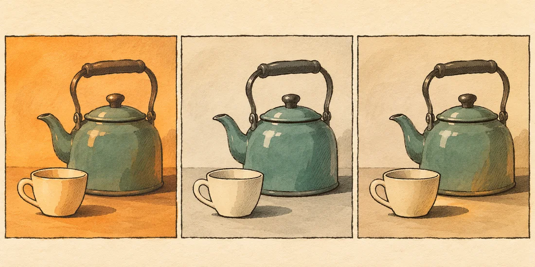
- Remove an unintended cast. If the cup and background both turn orange, adjust temperature and tint while watching the kettle. The cream cup should still look cream.
- Check the recurring color. If the cup matches but the kettle has shifted toward blue, look for a selective hue adjustment in your editor. Inspect reflections and highlights to see what else the correction touches.
- Apply the scene look. Once the clips match, try a shared grade for the scene and watch how it affects the product. If the creative look pushes the enamel away from its approved color, lower the strength or adjust that color separately.
| What you see | Where to start |
|---|---|
| The whole shot looks warmer | Compare a shared surface, then adjust temperature and tint |
| Only the recurring object shifts hue | Check the approved reference, then try a selective adjustment |
| The clip starts on target and shifts near the end | Compare several frames and decide whether a timed adjustment is enough |
| A shadow changes direction across the cut | Review the underlying shot and consider a replacement |
Review the color at each cut
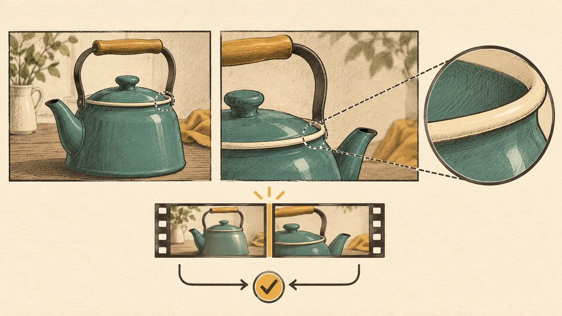
Play the sequence at normal speed. Pause on the last frame before a cut and the first frame after it. Ask whether the change in color makes sense for the angle and light. A highlight may shift naturally as the camera moves, while an abrupt change in the kettle’s overall hue may make it look like a different item.
Scrub through the middle of each clip as well. If the lighting drifts slowly, a gentle keyframed correction can be worth trying. If the color flickers or changes together with the object’s shape, correcting hue alone leaves the geometry problem. Replace the affected portion or regenerate from an approved opening still. Check the exported file at the intended viewing size, especially on cuts where the recurring product occupies a large part of the frame.
Frequently asked questions
Should I apply one LUT to every AI clip?
A shared LUT can give a scene a consistent style after correction. First check whether the clips start with similar exposure, white balance and color space. If they differ visibly, correct each clip before applying the shared look.
How closely should I match a product color?
For a product that customers need to recognize or choose by color, compare the generated clip with approved photography or real footage. Use stable midtones as a reference and allow for believable differences caused by shadow and reflection.
Can I fix color drift inside one AI clip?
A gradual shift can sometimes be corrected with keyframes in a video editor. Fast flicker, changing reflections or altered product geometry can require a replacement shot. Check several points in the clip before choosing a fix.
Can I use a still image as the color reference?
Yes. An approved still can set the intended palette. Compare it with frames from the finished clips and check the actual transition across each cut to catch motion-related changes.